
Halvork, a brand and its store designed as one
Halvork is our own brand, built from scratch to show how we take a product from a name to a paid order. The identity and the store were designed together, so each screen has one job in the sale.
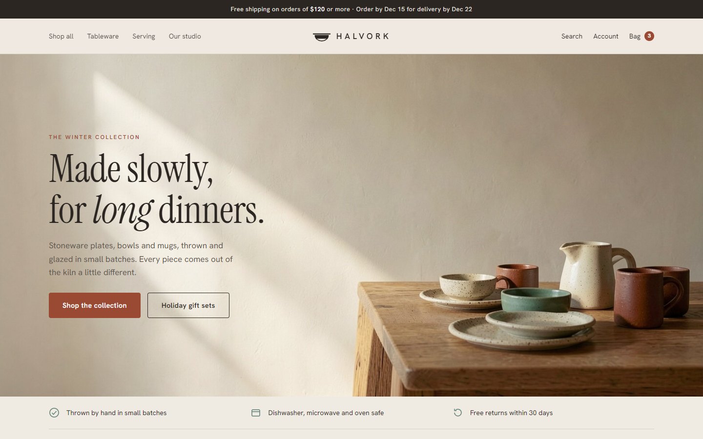
Every screen is a page you can click through, from the homepage to the order confirmation. Open the store
Three decisions that shape it
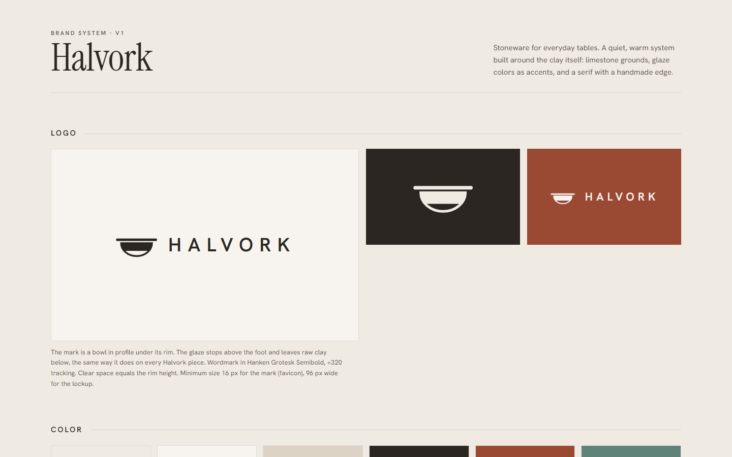
The glaze is the logo
The mark is a bowl in profile. Its glaze stops above the foot and leaves raw clay below, a detail you see on handmade pottery. It holds up at 16 px as a favicon.
One color sells
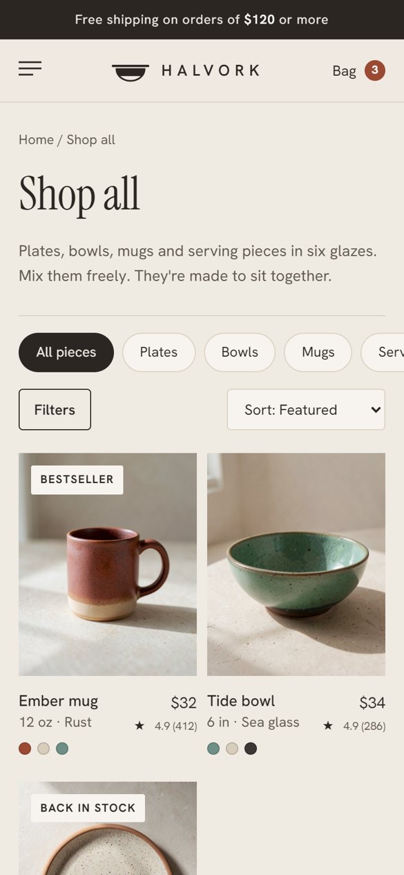
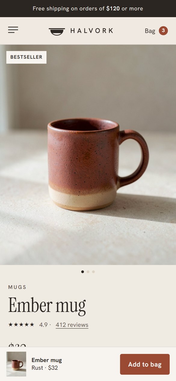
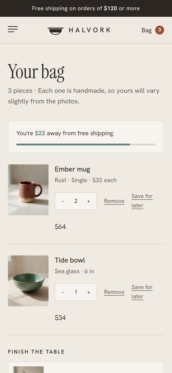
Rust appears only on the action that moves the sale forward on each screen. Sea glass is saved for good news, like free shipping unlocked or a delivery date.
Say it varies first
Handmade pieces never match the photo exactly. The store says so on the product page, in the bag and after checkout, so a likely complaint becomes part of the appeal.
The store on desktop
Tap any screen to see the full page.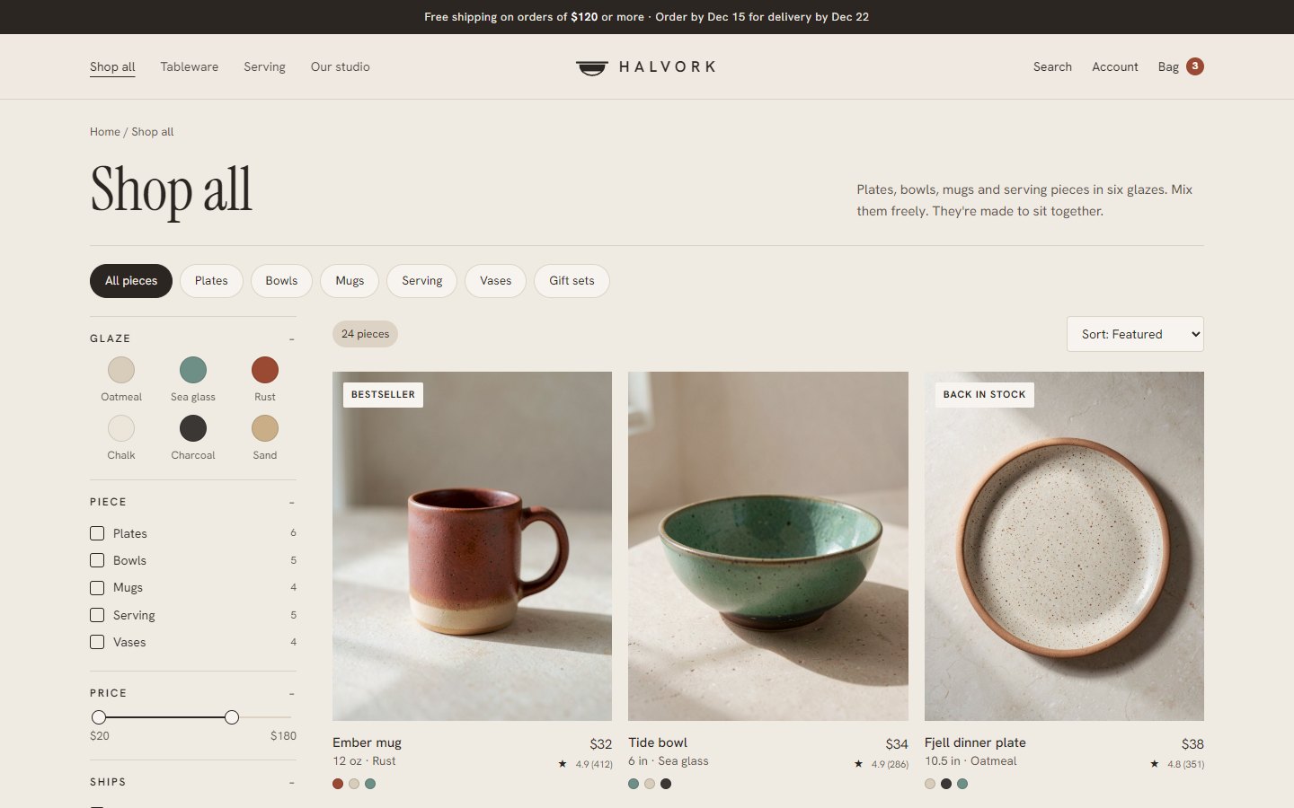
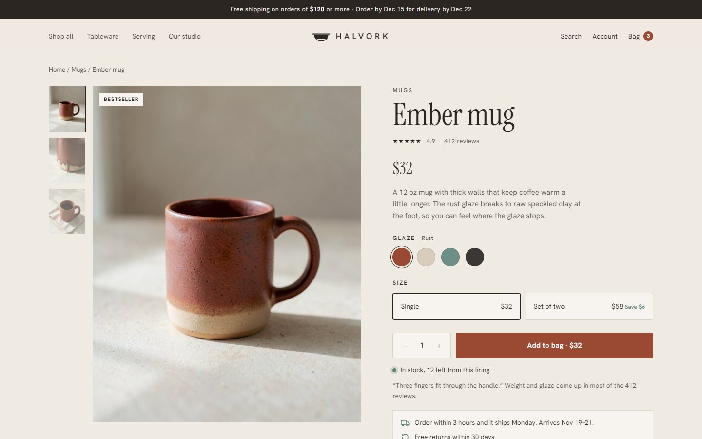
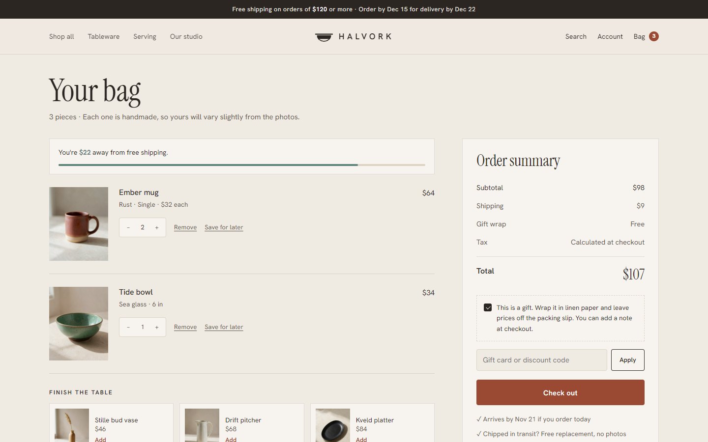
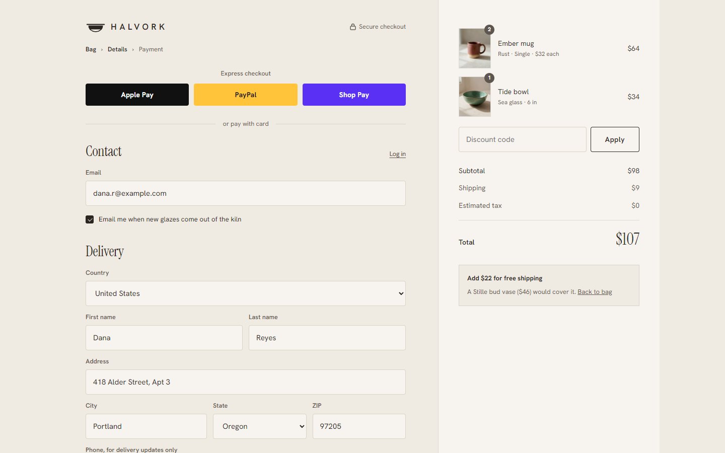
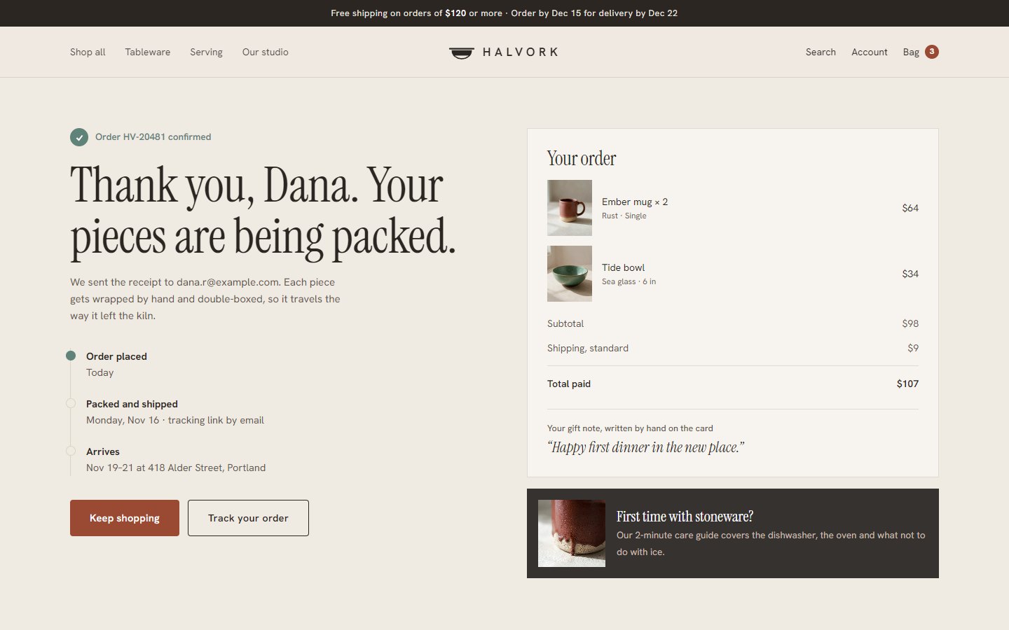
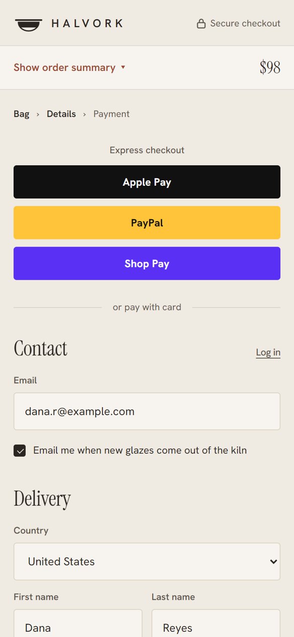
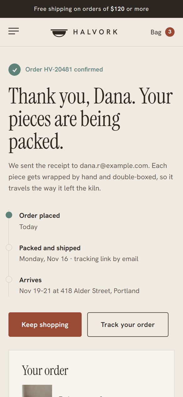
On a phone
Designed at 390 px, not squeezed from desktop.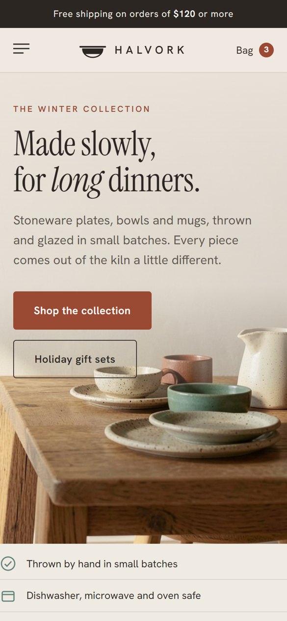
Small things that help the sale
Halvork is a made-up brand we created for our portfolio. Name, identity, store design and image direction by Leo Reed Studio. Product images are AI-generated.